WordPress 5.3 “Kirk” is out! It’s the third major WordPress release this year – and it includes some interesting changes. Let’s dive in.
Gutenberg
Despite early reluctance to the new editor, it really seems as though the WordPress community is warming up to it. This release in particular makes some changes to Gutenberg that enable some powerful content design possibilities.
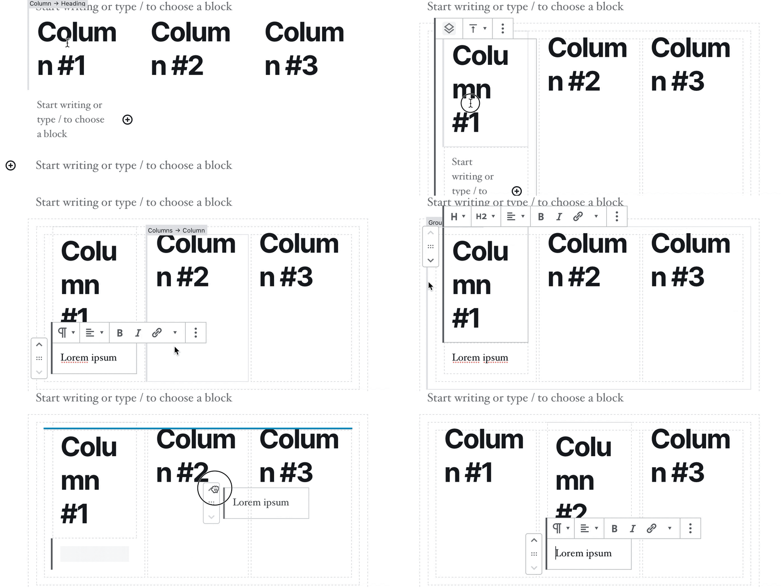
If you’ve been reluctant to give Gutenberg a shot, now might be a good time to take a fresh look. Of particular note is the Group Block.
With the group block, you could try combining multiple blocks into a “wide width” group block, with a background colour.

You could also save a group as a reusable block, creating an insertable multi-block section. Imagine a “buy my eBook” breakaway, or a newsletter signup.
There are still a few bugs – Gutenberg still feels to me like a late-stage beta.
Sometimes a feeling is all we humans have to go on.
Captain James T. Kirk
But we’re getting closer. The UX of traversing through layers of nested blocks and columns has improved a lot in this release, but it’s still very clunky.

Background colour gradients didn’t make it into this release – but I think we can safely expect to see them land in 5.4.
Twenty Twenty
This is the first theme since Twenty Sixteen that I can get behind. I absolutely love it (and I’m running it on this blog).
The team behind Twenty Twenty has perfectly balanced the design’s opinion and flexibility. It seems to have taken a lot of inspiration from another personal favourite of mine: Tabor.
It’s light-weight, simple, and includes a beautiful custom typeface called Inter. Shipping an open source typeface with the theme is a stroke of genius for fighting back against Google Fonts (brilliant, but very privacy invasive).
This means that aside from Gravatar (and any embeds that I put in my posts) this site loads without calling any external scripts or styles!
a11y
Short for “Accessibility”, a11y was a huge focus in this release. Many of these updates are related to navigating the block editor with a keyboard, but the most obvious change is the WP Admin colour scheme.


If you’re using the default colour scheme (you can change this from your profile page), WordPress is now much more high contrast – interactive controls and metaboxes have darker borders and lighter backgrounds.
Personally, I’m all for making WordPress more accessible. There has, however, been some criticism of the new design.
The old CSS was better. Now there are lines lines lines lines borders everywhere. It is really bad for eyes, like a table with dark lines…I think i will overwrite it with custom css.
Sonjoe
Is accessibility always this ugly? Or is WP ahead of the curve and all web interfaces will be this ugly eventually?
Phil
Its not only ugly, but this style is making my eyes hurt. The contrast is way to high and I’m can’t shake the feeling that I’m looking at windows 95.
tatof
Ouch! The Make Post announcing these changes has a lot more where that came from.
MacOS has a “high contrast” accessibility feature, which can be toggled on and off. That seems like a good compromise to me – even if the high contrast mode is enabled by default. The WordPress a11y team seems to have some strong opinions that run counter to that, though, so I can’t see this happening.
Admin Email Verification
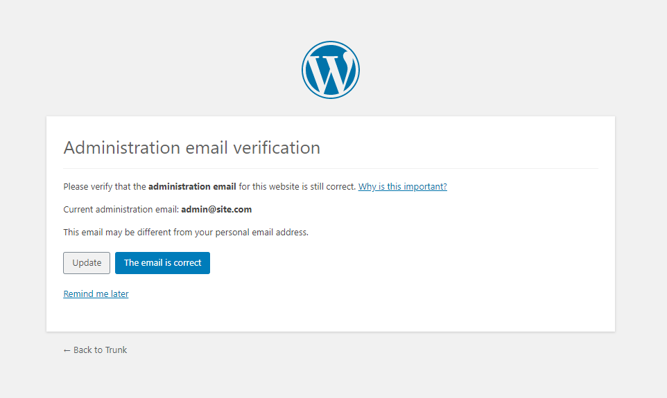
Another sore point. The idea here is that WordPress will now periodically check that the admin email setting is correct. Slightly annoying, but I can see how that might solve some security problems for users who don’t log in very often.

There was some heat around this topic in the WP Australia community. Gal Baras brought up a good point:
WordPress is clearly not subscribing to the Unix philosophy of trusting the user to know what they’re doing. It keeps trying to control things based on the assumption the site owners need to be saved from themselves…
… being prompted every 6 months to verify my admin email on the number of sites I have is not making me happy.
Gal Baras
A similar tone was struck in a WP Tavern article describing the feature.
I work on hundreds of sites, for each one I have a local install and a staging site (I code locally and upload to staging for review). So two thirds of the sites I work on aren’t “real” websites and a third aren’t accessible on the web.
James Mailen
More bloat. No need for this in the core.
John Rood
The feature can be turned off with a filter (admin_email_check_interval), but maybe this should have been an option, instead?
Personally, I’ve not ever had a problem caused by this setting being incorrect, and I’ve run into the verification screen enough times that I automatically click through without actually reading it. So from that perspective, it’s more annoying than helpful for me.
The Core Team vs. The User Community
Admin email verification isn’t a hill I’m willing to die on. More interesting to me is the negative response from the community. Both on this issue, and accessibility. Has the core team learned nothing from the Gutenberg release?
Even the most enthusiastic Gutenberg proponents (I count myself among them) have to admit that the rollout of the new Editor was terrible. The Classic Editor plugin only came out last year and already it’s the fourth most popular plugin of all time!
Communication from the Gutenberg team was nowhere near good enough, and the user community felt dismissed and unheard.
It seems to me that the core WordPress team are becoming increasingly perceived as pretentious and aloof. The democratic and libertarian values that underpin WordPress are being twisted into an alarming refusal to listen.
Maybe it’s due to the “Benevolent Dictator for Life” model behind Matt Mullenweg’s leadership (there’s a WordPress Governance Project which doesn’t seem to be going anywhere). Maybe it’s a well intentioned effort to stand behind under-represented minorities, even in the face of overwhelming negative feedback.
I don’t pretend to have all the answers, but surely acknowledgement and empathy would be a better approach than “we think this is important, so it’s going to happen whether you like it or not”.